

The Ultimate Guide to Choosing Between RGB and CMYK for Printed Materials

As an author, if you want to promote your brand or publish your book, it’s crucial to have high-quality printed materials like bookmarks, business cards, or even stickers. However, designing for print is not the same as designing for the web, as the colors may differ between the two. When designing printed materials, you have to consider the color mode: RGB or CMYK. In this guide, we’ll explore the differences and provide tips to ensure your designs look good both on the screen and when printed.
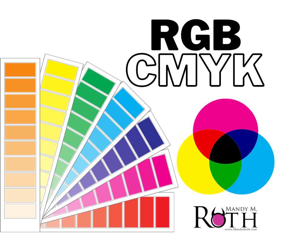
RGB vs. CMYK:
RGB stands for Red, Green, and Blue, which are the primary colors needed to create the colors you see on a digital screen. When combined, they create a wide variety of shades. CMYK, on the other hand, stands for Cyan, Magenta, Yellow, and Key (Black). This is the color mode used in the printing process, where the colors are layered, mixed, and applied to the paper in different amounts to produce the desired colors.
When to use RGB:
RGB is perfect for anything that is intended to be viewed on a screen, such as websites, digital ads, or social media graphics. It’s the color mode that is most compatible with digital devices and can reproduce bright and vibrant colors that can grab the viewer’s attention.
When to use CMYK:
CMYK is suitable for printing, as it’s the color mode that matches the printer’s inks. It can reproduce more muted and subtle colors and is the color mode that most printers use. It’s important to note that if you design something in RGB and then convert it to CMYK, the colors will shift. Therefore, it’s essential to work in the correct color mode from the beginning.
Tips for designing print-ready materials:
Set up your document in CMYK mode before you start designing.
Use a color library that is CMYK-specific to ensure that the colors will turn out the way you expect.
Make sure to use DPI (dots per inch) resolution of at least 300 to ensure the image or graphic is high-quality.
Always review your work as a print-ready PDF before sending it to the printer. This will help you catch any issues with color shifts, orientation, or even spelling or grammar mistakes.
Designing printed materials can be a bit tricky, especially when it comes to choosing the right color mode. RGB is perfect for anything that will be viewed on a screen, while CMYK is the color mode you should use for printed materials. Remember, designing print-ready materials requires extra precautions like setting up your document in the correct mode, using a CMYK-specific color library, and reviewing your work in a print-ready PDF to catch errors. By following these tips, you’ll ensure that your promotional materials, including stickers, turn out the way you want them to.
Canva: Here are some handy tips for using CMYK and exporting it in Canva.
Sticker Mule: Here is a great downloadable CMYK color guide provided by StickerMule
Photoshop and Illustrator: converting from RGB to CMYK